

Wirral Waters
Softening a waterside regeneration brand for wider B2C applications.
About Wirral Waters
Wirral Waters is part of a widespread waterside regeneration scheme, akin to an earlier project I have featured, Glasgow Waters. Wirral Waters comprises a collection of various different neighbourhoods currently in construction. Such neighbourhoods include Northbank, Four Bridges and Marina View, all of which are purpose built for residential and leisure. Whereas MEA park is dedicated as a manufacturing, logistics and distribution campus. Together, they create a mixed-use, high-density, highly sustainable community that elevates and uplifts the existing surrounding areas.
Existing brand elements


Key phrases and straplines.
The essence of Wirral Waters will be captured throughout its photography, we wanted to show everything the project has to offer, but to also celebrate the elements on the River Mersey.
Style and colours found within the photography should be similar or complement the brand tones and colour palette, with soft natural lighting. The surrounding environment should be embraced often, with skies, wind and nature, all with dynamic crops of architecture and unique angles which leave the viewer wanting to investigate further.

Examples of the graphic pattern combined with the chosen grid layouts. This provides a playful accent and flexible assets throughout the material, an abstract combination of sea, wind and hardness to represent new communities on the waterfront.
Representing the Spirit of
Wirral Waters


Inspiration
We wanted to introduce an illustration style that would warm the strongly corporate looking ‘waters’ brand. While ensuring the illustrations didn’t overpower the page and draw too much attention away from the message.
I’ve seen continuous line art introduced in the past, which create a calm flow to the page, this style can neatly in keep with the brands colours and layout guidelines with lots of versatility.
A studio I took strong inspiration from was a Parisian artist who goes by the name Differantly.
He describes his work as “straddling the line between fine art and new media” appearing delicate yet very applicable to modern brands. Creating “singular visual experiences”, he has collaborated with many world famous brands such as Apple, Nike, Cartier and Adidas.
Many of his works are shown within physical spaces. It was great to see how this style could be implemented into various environments. With many large format applications existing in and around the Wirral Waters site, the possibilities of this art style have shown huge promise.


Artist: Differantly (both pieces)
Realised illustrations


First application of new illustrations
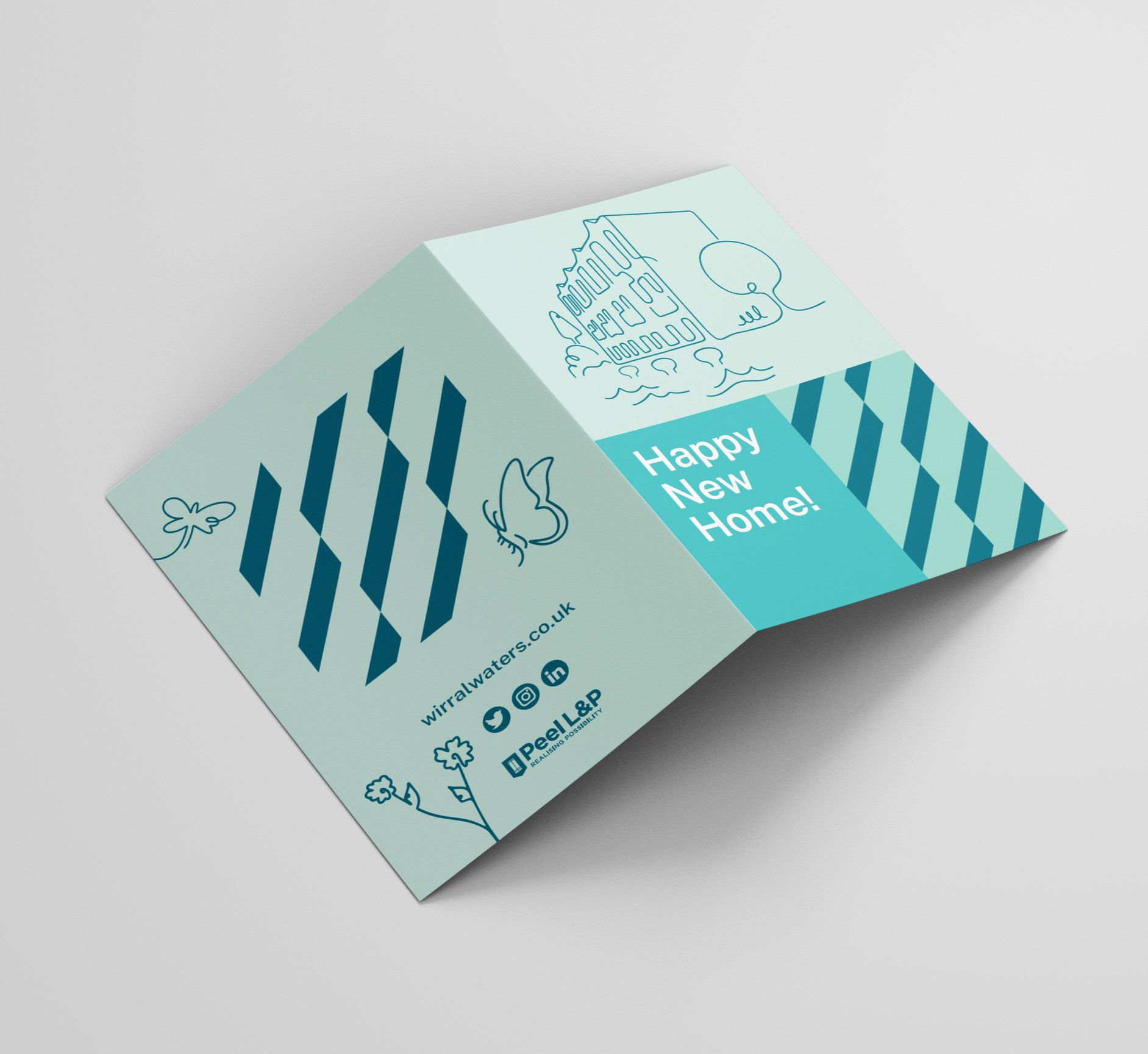
The requirement for some brand illustrations came from a welcome card for new residents at the Redbridge Quay development, it was the first site of the Wirral Waters development to near completion, and so it opened its arms to its first residents. The identity needed these illustrations to be more consumer facing, to create a stronger sense of friendliness.
This initial need led to the creation of a suite of simple and effective illustrations, which can be utilised for various applications across print and digital.


A glimpse of the new homes available at Redbridge Quay.