Nab & Nancy
Combining two homely landmarks to create a meaningful brand.
Create a fresh brand identity for a new independent craft business for the village of Bollington. Incorporating the geographical nickname given to it, known as the ‘Happy Valley’.
——
The brief (Self-initiated)
The identity has been designed as an artisan bakery. Ideally suiting a young pair of hands who wish to begin a local business, offering quality goods and value to the community. Proudly boasting its establishment in 2020, the business seeks to be an identity for the future, looking forward and breathing a modern flair into the village. Alongside such ideals include the need to be sustainable and eco-minded, packaging and food waste being at
the forefront.
Bollington, an old mill town with a deep history and lots of character. A family orientated community with a population of about 9,000, featuring lots of scenic farmland and a well-coveted canal known as the river Bollin. The town nestles in what’s known as the ‘Happy Valley’, between the areas two highest points - the Nab and the landmark White Nancy. Lending themselves to the brand name - Nab & Nancy. While sounding fresh and contemporary, the name encapsulates not just Bollington but the surrounding rural areas and its natural beauty.
The response
Bollington still has many local businesses with loyal customers. We are seeing a return to increasing appreciation for fresh produce and quality personal services. Nab & Nancy will bring a fresh and trendy spot to the centre of Bollington village. A bakery catering to the community and visitors alike.
The Nab & Nancy brand draws inspiration from the various characteristics that make up Bollington and its surrounding areas. The village is defined by a relaxed and calming environment which features many local walks, a long stretching canal running directly through the village, as well as many scenic views and farm lands.
Signature pattern & postcards
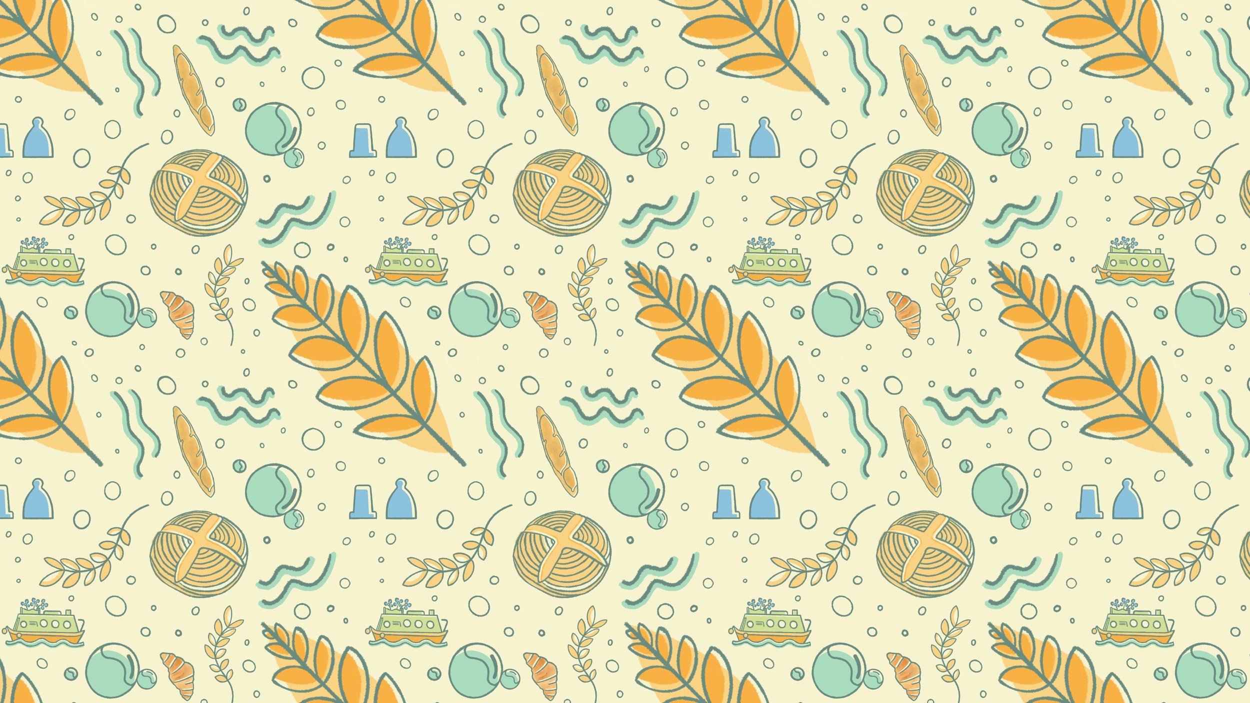
The brand focuses on hand-drawn images reflecting the craft nature of the business, the quality and care in baking, while combining the main features of Bollington. These icons have been combined to create a characterful pattern with consistent colours which can be used for various applications across many mediums. Primarily print.
Bread packaging
The continuous pattern makes for pleasing wrapping paper, all of which will be recycled, which would become an instantly recognisable visual cue around the village. Keeping the ritual of buying locally made quality bread in the minds of the local community.
Menu
Nab & Nancy will push primarily on quality breads and pastries to be bought over the counter. However, also functions as a small cafe. It is essential the bakery projects itself onto the street and serves passersby.
The village of Bollington has various walking and hiking routes which stretch outwards into the Peak District. Nab & Nancy hopes to operate as a ‘checkpoint’ to these hikers and adventurers.
Promotional material and merchandise
The brand is positioned as being eco-minded and sustainable. Meaning sustainable packaging materials and reusable cups for its coffee service. The bakery will sell sustainable products that people are proud to own, using variations of brand drawings and patterns - including reusable coffee mugs, blankets
and t-shirts.
Online presence
The bakery’s online website will be ‘with the times’. Featuring a handy online shop with a click and collect service, while also providing engaging valuable content - such as how the bakery started, tips and tricks on making homemade bread, along with an active online community via social media.
———
Upon reflection
I am still fond of this work as another personal passion project, much like the
Hector & Sylfan brewing brand identity.
There are many aspects of this work I would change as I reflect today. Considerations of scalability, as well as more responsive and considered digital design. I would also pull back on the brand pattern, to use only where
most suitable.
My experience has also taught me to consider the narrative of the brand, which is why I prefer Hector and Sylfan as an identity, as it tells a much more compelling story over Nab & Nancy. My work at Peel, as well as any future work will always consider these key thought processes.


