Northstone
Introduction
Northstone is an award-winning, innovative, evironmentally minded home building company. The focus behind each home is all about how people will live, what do they require, both inside and outside. What can Northstone offer which makes life that little bit easier. But it’s not just about the home itself, but also the communities around them. On a mission to create a more neighbourly world.
Northstone are based throughout the North West of England. With various neighbourhoods situated around Bolton, Greater Manchester and Wigan.
——
My involvement within the business has been varied. For a time I helped with various kinds of work, as a part of the design team within the company that owns Northstone.
And on occasion since the business hired a dedicated Head of Creative, Joe Luk. This has been in a freelance capacity since moving on from Peel L&P, a North West property company.
——
I have included one of my favourite projects I’d worked on for Northstone within this case study. But firstly, I’d like to outline the fantastic brand development by Joe Luk, in order to give context.
Brand context
The brand was recently developed a year past by Joe Luk, Northstone’s dedicated Head of Creative. The company had a previous brand identity that encompassed many scandinavian design principles, which has been polished and refined into this clear and considered image.
Simplicity is built into the indentity, illustrations are used sparingly to help carry the message when necessary. It’s strong Gothic typography and photographic art direction are what sets the company apart from many in the industry. Accompanied by an earthern colour palette which can be utilised to represent many messages from home living, to construction processes and sustainability targets.
Tone of voice was a wholly refreshed approach to the brand. Its become integral in creating long term connection with the company’s residents, combined with a warm and caring sales and maintenance staff.
The tone has shifted to ‘fun and irreverent’ language. To show eagerness and passion for all that’s being accomplished at Northstone. It seeks to ‘disarm’ the audience and quickly build rapport, allowing potential buyers to feel at ease.
There are key terms that have been altered to further soften communications with both residents and potential buyers. As well as general industry people. Terms such as ‘neighbourhoods’, rather than ‘developments’ or ‘sites’. Homes instead of ‘plots and units’.
Simply put, Northstone’s photography is naturally ‘cosy’. The company wants to show an authentic look into resident life. It feels relatable, comforting and homely. Every element of Northstone’s house design is considered, and the photography should reflect that, especially when the homeowners are nice and settled. The focus should be long into the future, and the memories made along the way.
Northstone Corten Panels
About the project
My first big project, and a very permanent one. I’m extremely fond of this piece of work. A real opportunity to express my artistic abilities.
Northstone has created a consistent sense of place for each neighbourhood, which has made the brand recognisable in local communities. Many of these sites could be a copy and paste format, but that simply isn’t the belief at Northstone. Each set of site panels are different from the last and celebrate each individual location. Just like the site designs themselves.
The main requirement of this project, was to be in keeping with the past installation styles at other Northstone neighbourhoods. Make sure to represent the community, and create a sense of seamlessness between each panel, as one continued artwork.
Initial development and challenges
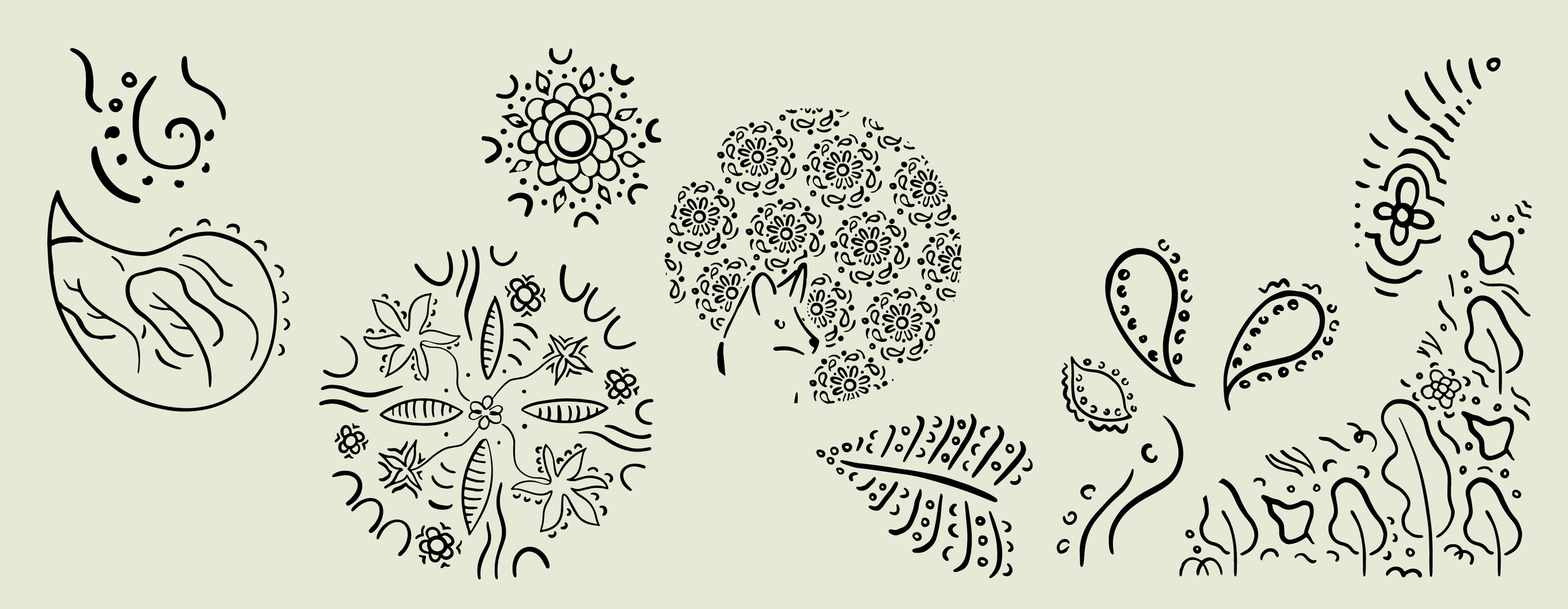
My initial thoughts led me towards creating varying patterns, to allow plenty of light through each panel. And to combine with various natural illustrations.
I was given initial demographics of the Bolton surrounding areas, with Airie being located specifically in Westhoughton. These areas are very diverse with people from all kinds of backgrounds, particularly Hindu, Sikh and Muslim. Many existing residents at the Airie neighbourhood are of these backgrounds. We wanted to celebrate this diversity in some manner, however neighbourhoods can change as people move in and out, so the inspiration was taken lightly. As a permanent installation, the thought of being relevant and inclusive was always in the back of my mind.
Informing inspiration
I wanted to incorporate inspiration from Henna designs to create rich contrasting patterns, that encompassed the floral variety found within the neighbourhood.
Initially, drawings were created showing many elements of british wildlife. However I thought to bring forward designs that would allow passersby to interpret the work in a more abstract fashion. I needed to make sure the words of Airie, ‘a gentle breath of wind’ were also represented within the artwork. Many suggestive marks and lines have been drawn to show a flow of movement throughout the panels.
Outcome
Upon reflection, the main occurance to highlight would be the way in which the panels were installed.
I had designed some areas of the panels lower to the ground, however the landscapers placed many knee-high bushes, which have consequently covered some illustrations during the spring and summer months.
I’m still very happy with the result, to put my name to the work. But it would have been a more considered result had I been put in contact with the landscapers.
Despite this, I’d be glad to take on another large format project. To have a piece of work out there in the physical space feels very fulfilling.
Credits
Zoe Nixon, Associate Director - Brand, Creative & Digital • Anita Jolley, Head of Sales • Kirsty Godrich, Head of Marketing • Joe Luk, Creative Lead • Tom Pearson, Junior Designer • Woodscape (supplier)


